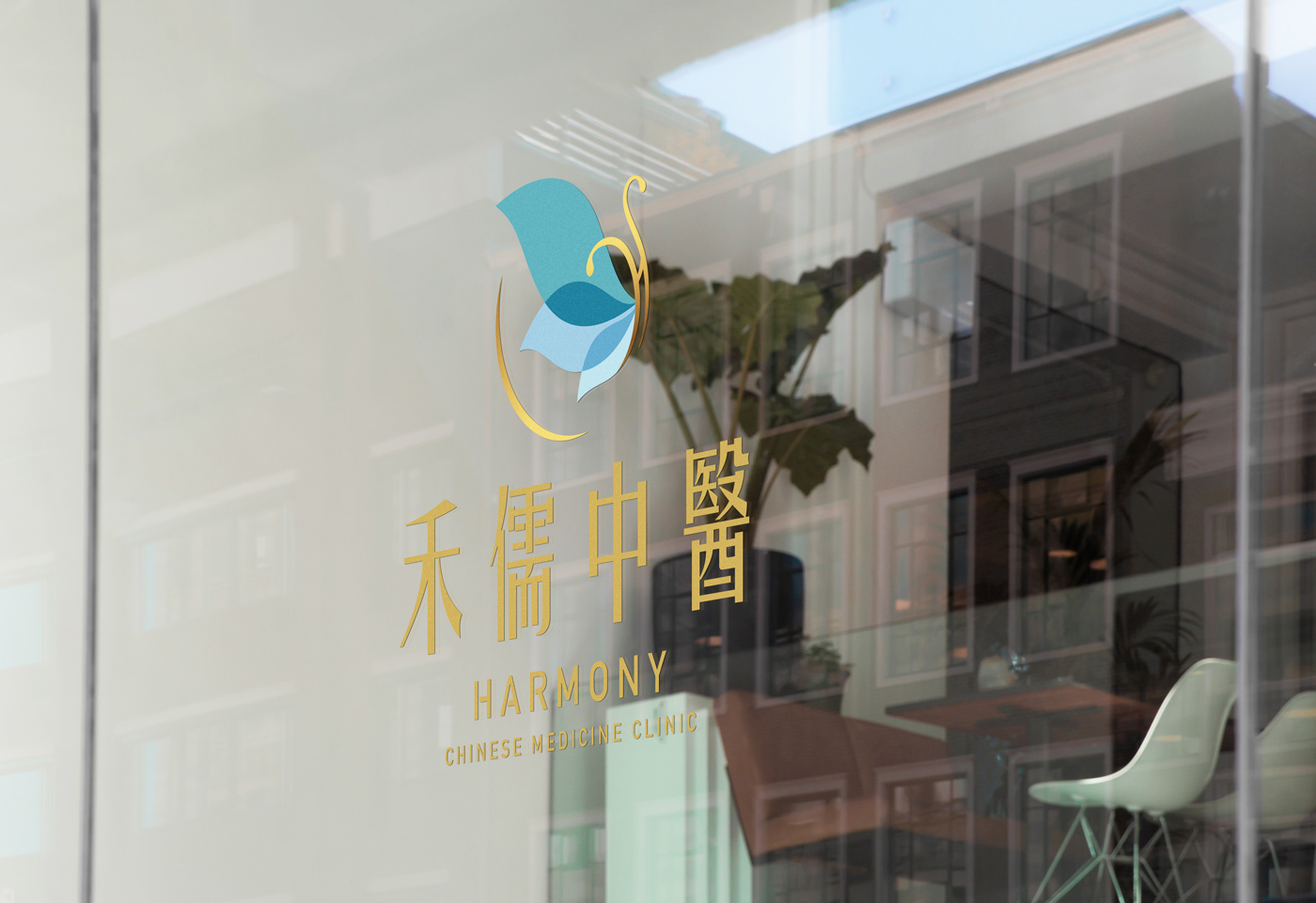
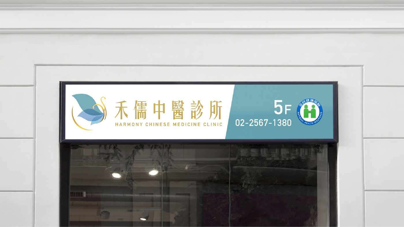
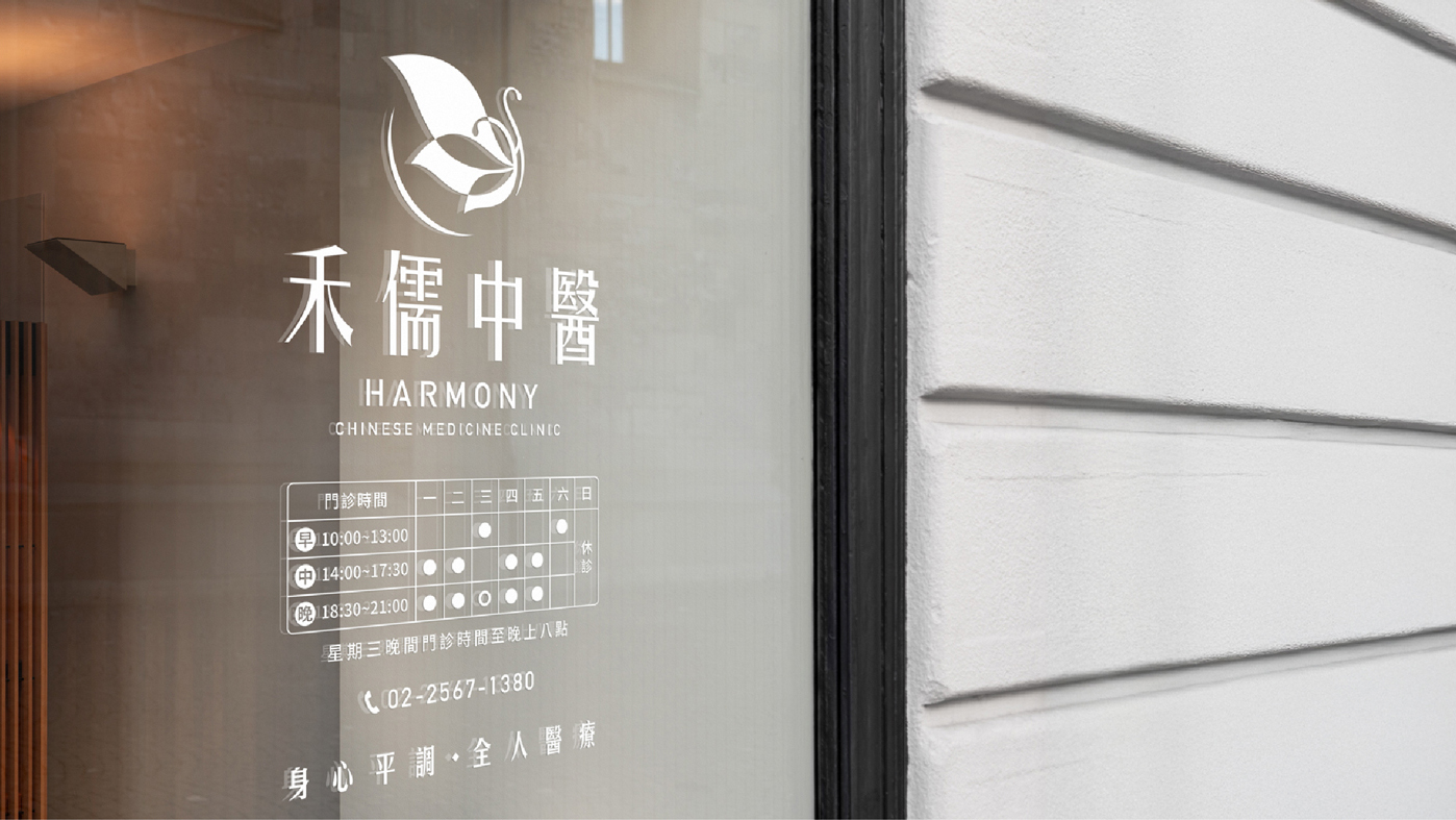
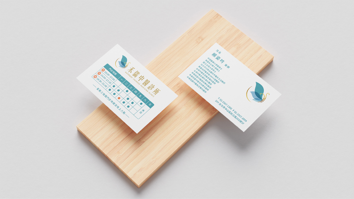
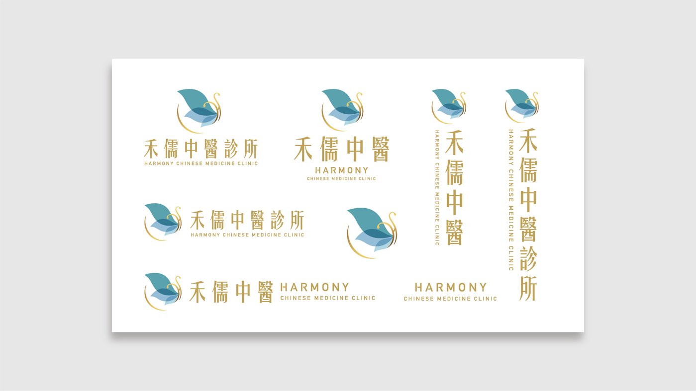
The logo concept is inspired by the image of a butterfly freely soaring, symbolizing rebirth and vitality. We have cleverly integrated the initial letter ‘H’ from the English name “Harmony,” creating a complete and cohesive visual design.
For the color palette, we opted for a translucent texture to mimic the delicate fluttering of butterfly wings. This design approach breaks away from the traditionally serious image of a Chinese medicine clinic while retaining a sense of professionalism and value. Additionally, we incorporated shimmering gold elements to add a touch of brightness, aiming to bring a sense of hope and positivity to patients.