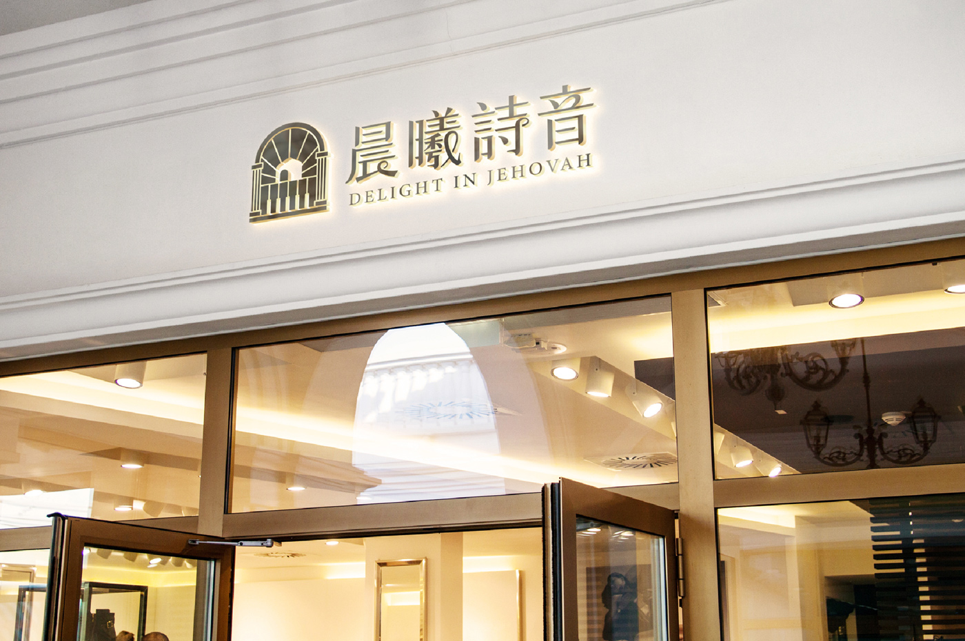
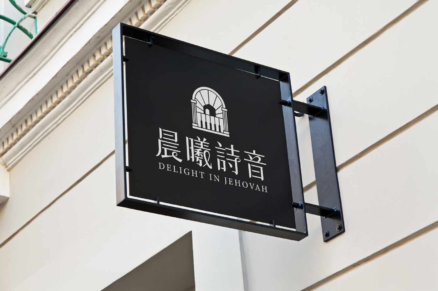
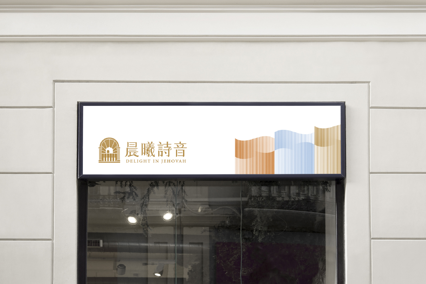
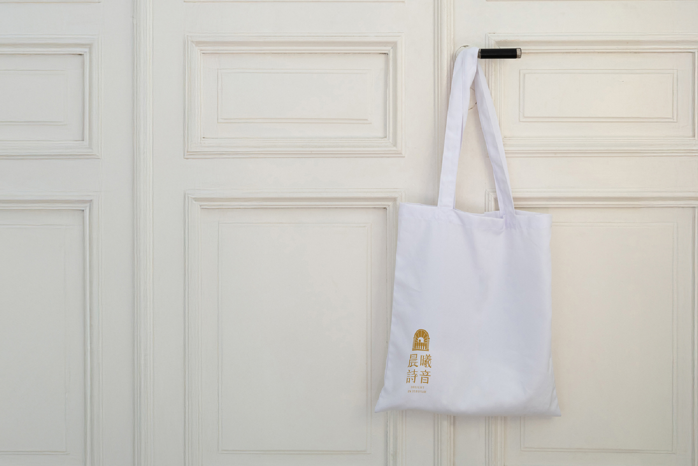
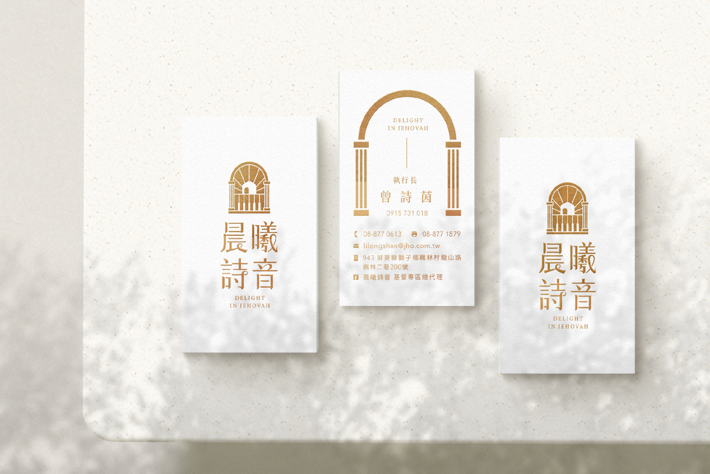
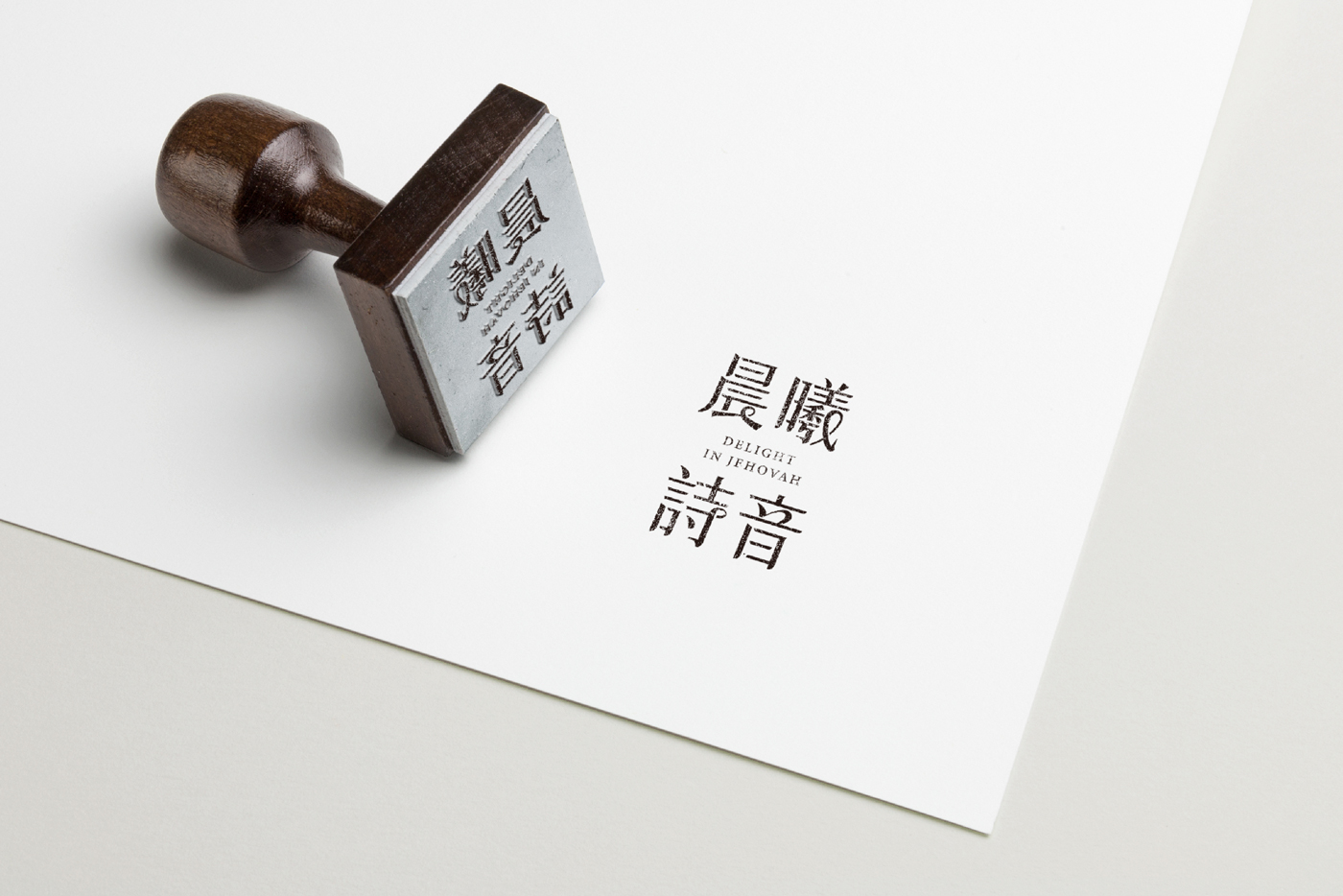
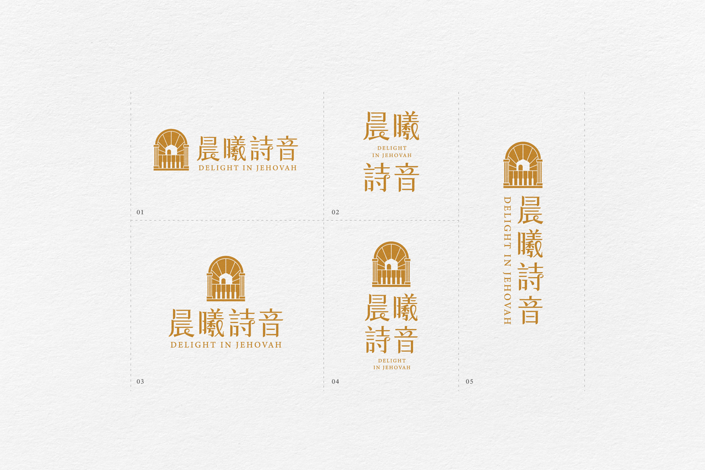
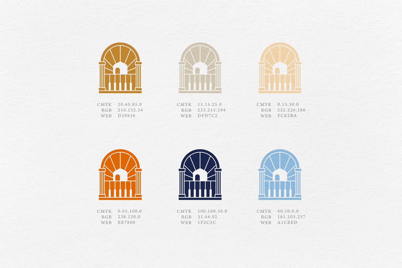
The logo design features an arch as the primary element, symbolizing stability, welcome, and openness, conveying the idea of an “entrance to a home.” This design evokes a sense of belonging and safety. The arch also incorporates the outline of a house, emphasizing the brand’s core values of family and a warm, homely lifestyle.
The golden linear pattern at the bottom of the logo is inspired by piano keys and musical staves, representing harmony and the flow of music and art. The design of the piano keys and musical notes not only reflects the brand’s elegance but also signifies the brand’s commitment to harmony and refinement in every detail. It evokes a sense of comfort and joy, reminiscent of the soothing melodies that fill a home.
The radiant sunlight element in the background symbolizes hope and warmth, much like the first light of dawn bringing new energy and brightness to the day. This sunburst design highlights the positive energy the brand offers, promising a warm and comforting experience for customers.