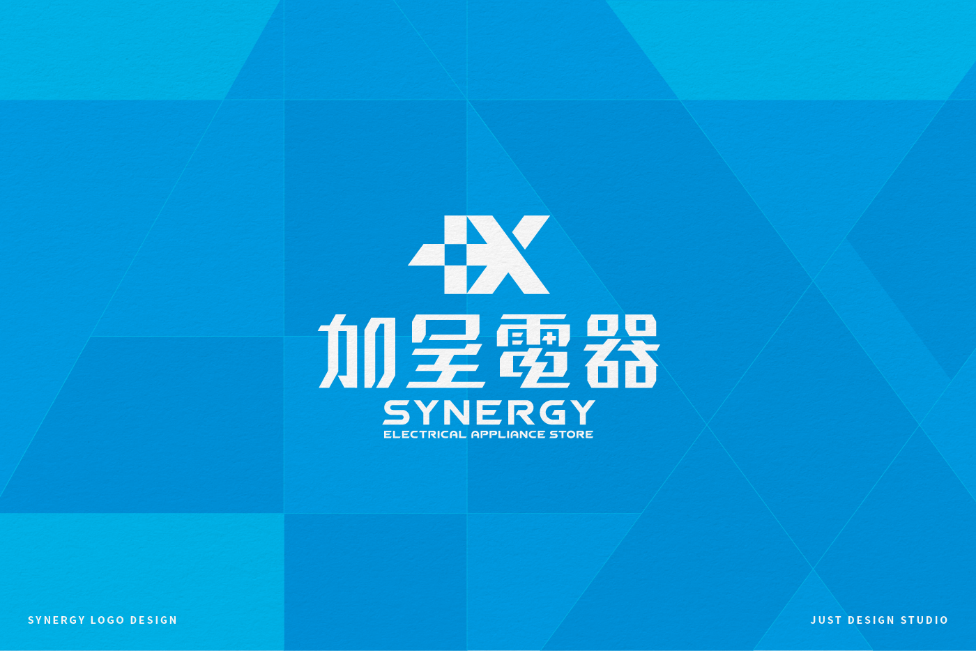
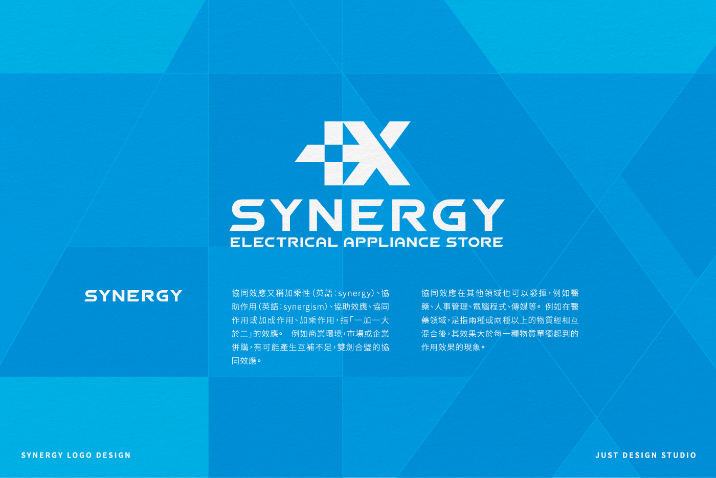
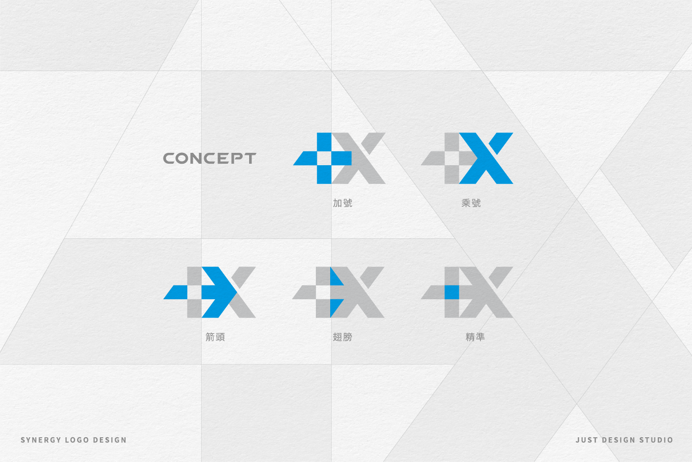
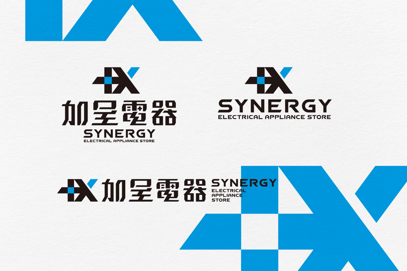
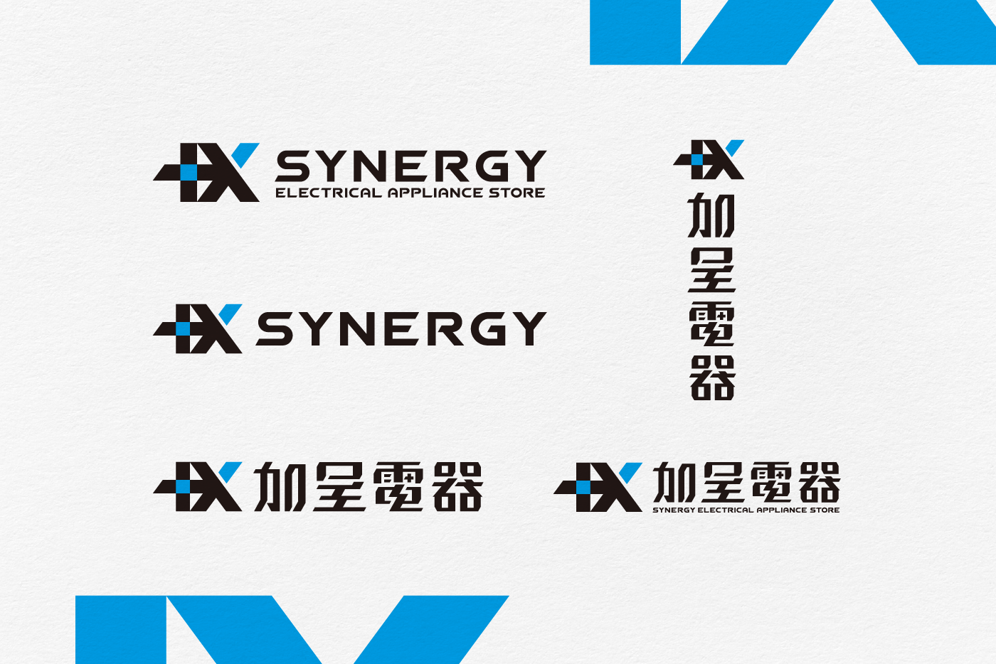
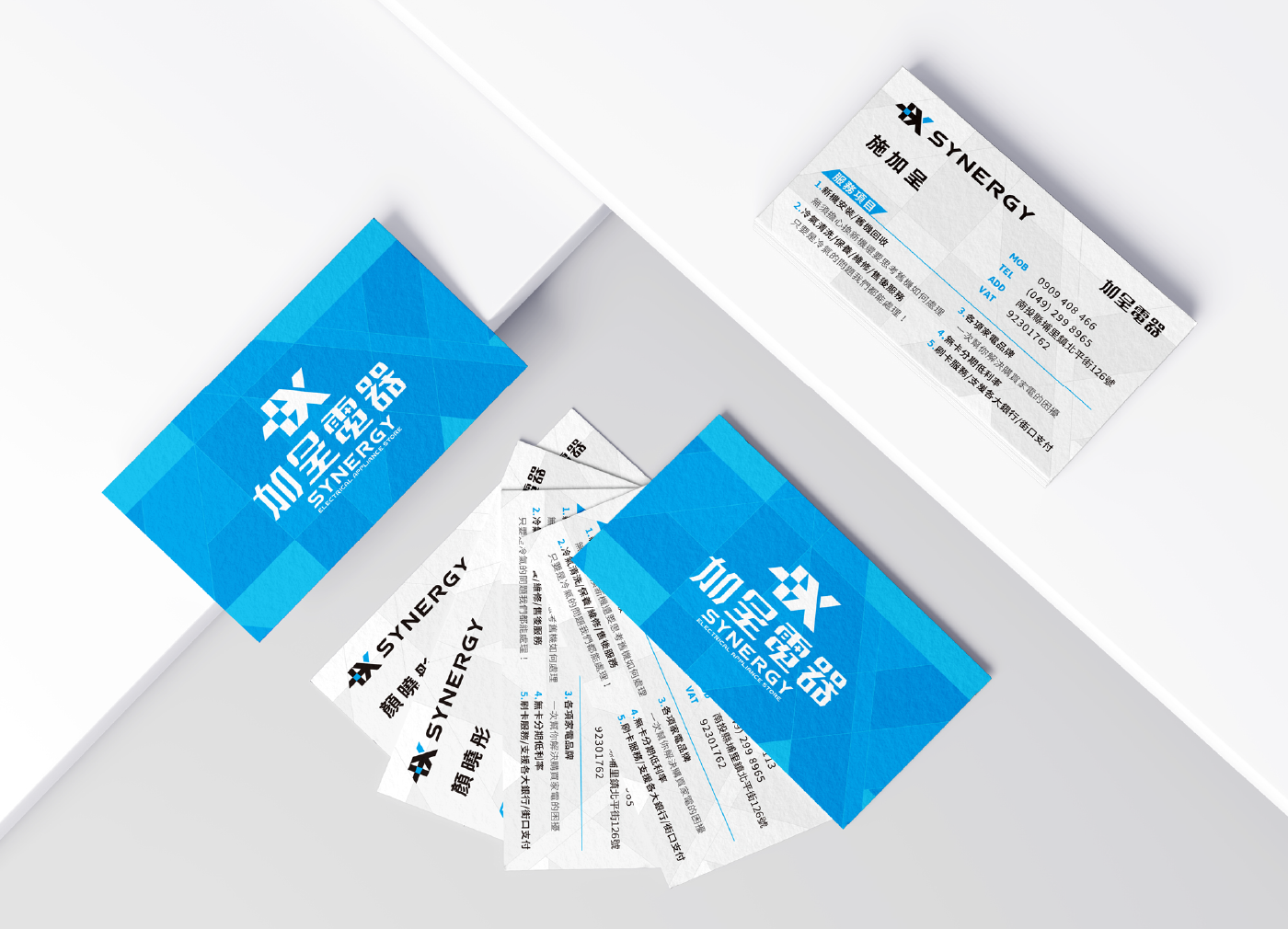
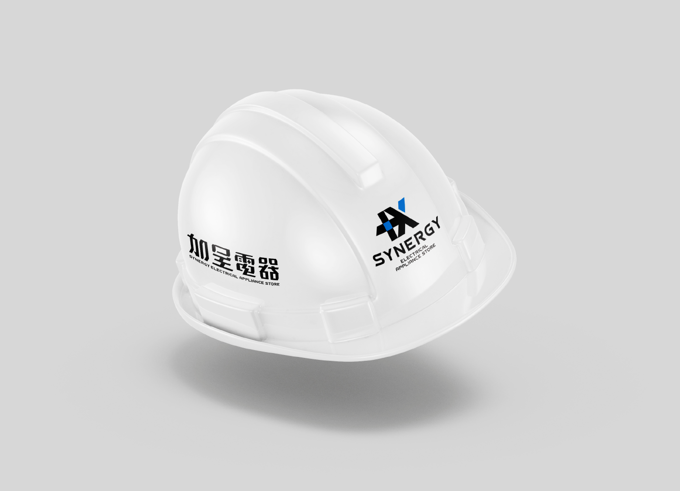
The brand name “Jia Cheng” is inspired by its phonetic similarity to “synergy,” embodying the idea of enhanced, multiplied effects. It reflects the company’s commitment to exponential growth by leveraging its core strengths: exceptional talent, high-quality products, and professional services. The logo design combines the plus and multiplication signs, creating an intuitive visual representation that leaves a lasting impression. The intersecting lines form a forward-pointing arrow, symbolizing Jia Cheng’s spirit of progress and pursuit of excellence. The negative space features two sharp triangles resembling wings, conveying speed and efficiency. The precise square cutout in the plus sign signifies Jia Cheng’s ability to quickly identify customer needs and respond with well-executed solutions.