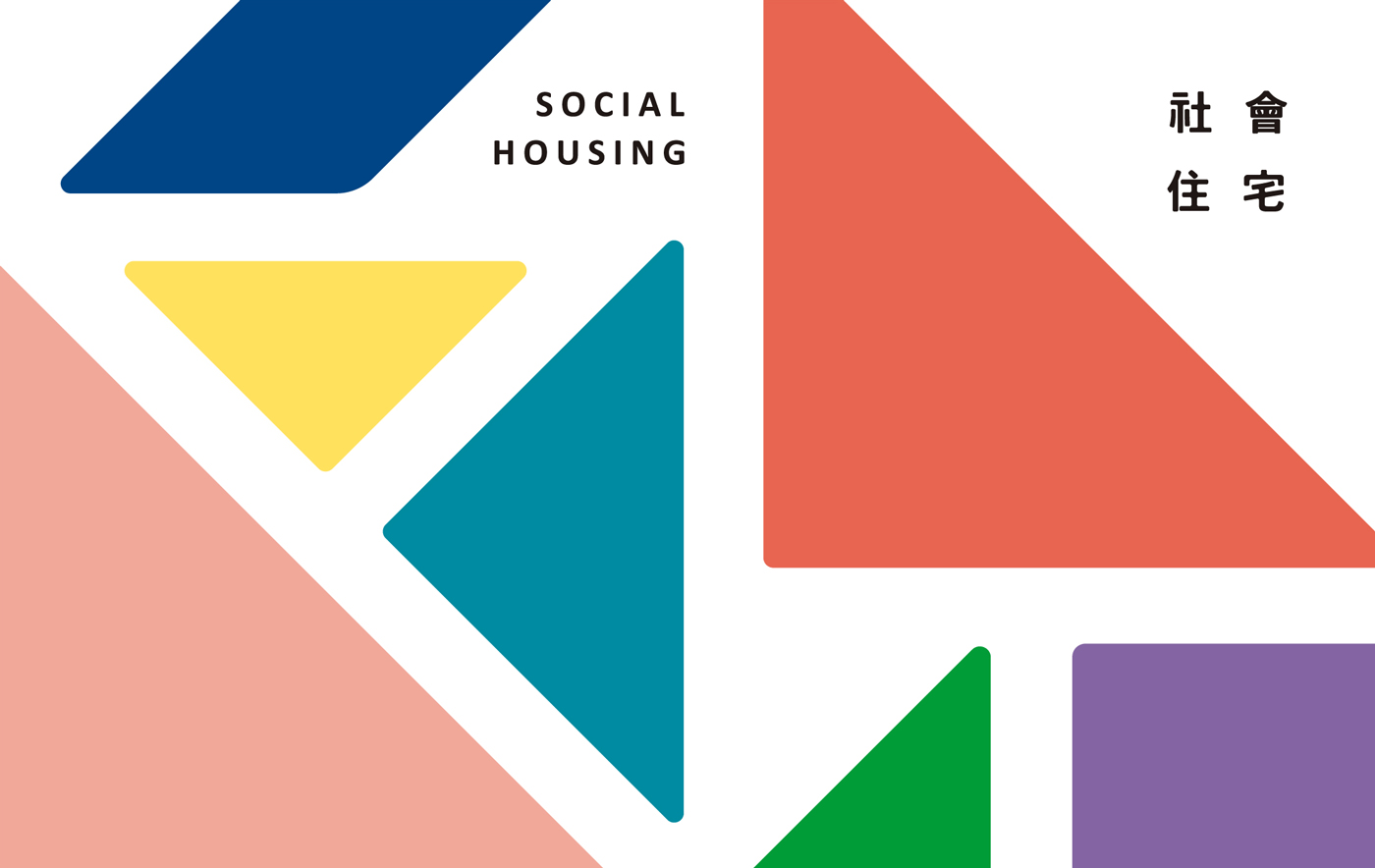
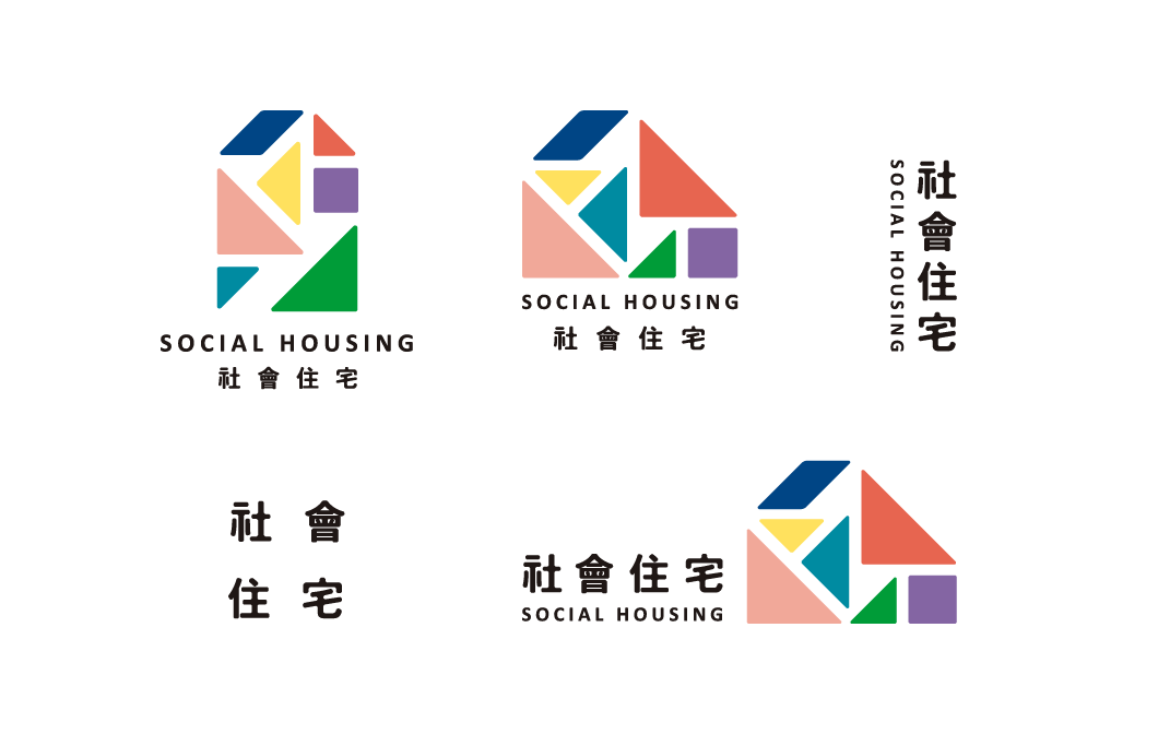
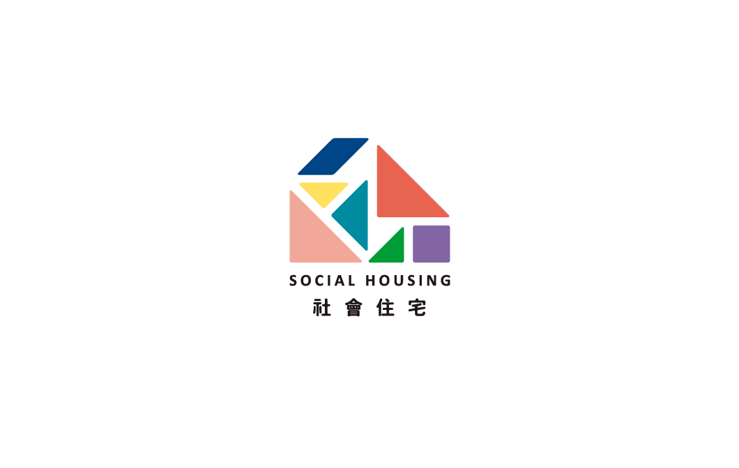
Logo Concept: The design concept is inspired by the tangram puzzle, representing a diverse and dynamic structure. With its various colors and combinations, the tangram symbolizes endless possibilities, just like social housing, where different communities live together. Each piece reflects a unique group, and together, they share the space, forming a big family.
Logo Application: Through a variety of combinations, the logo can be adapted into different icons and visuals, such as spaces for relaxation areas, gyms, communal areas, and reception zones. It can also be applied to promotional posters and social housing giveaway items. The design is also appealing to children, making it educational and fun, integrating seamlessly into their everyday experiences.
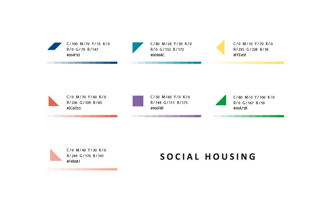
Color Meaning: The tangram features seven colors, each representing a different community group. I have reduced the color saturation of each piece to create a harmonious and visually pleasant palette. This softer, warmer color scheme helps convey a sense of comfort and unity. Through the arrangement, it forms a cohesive family, reflecting the hope that all groups in the social housing can freely enjoy the shared space together.