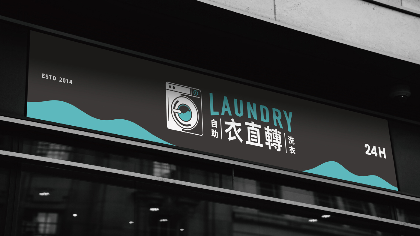
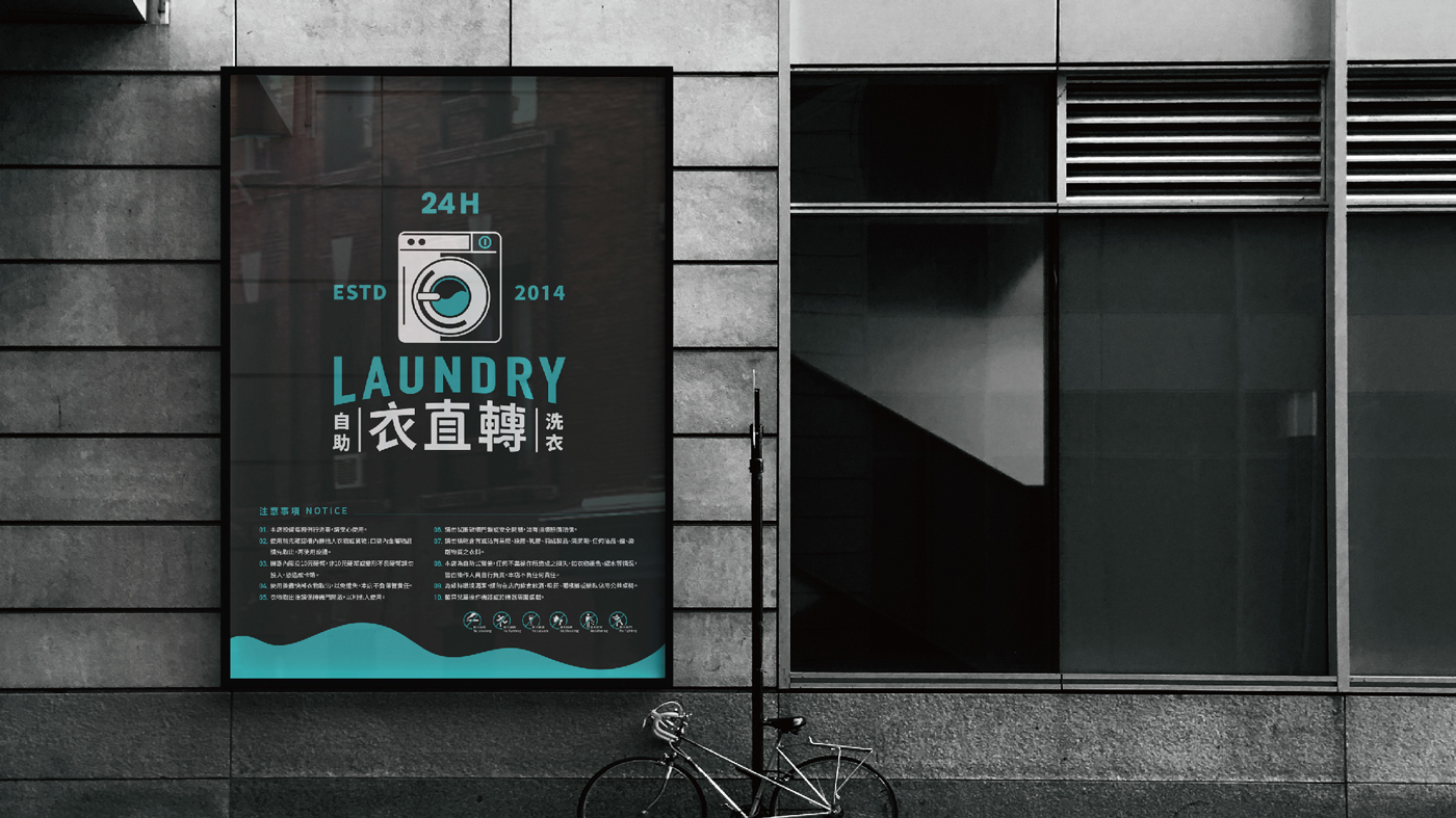
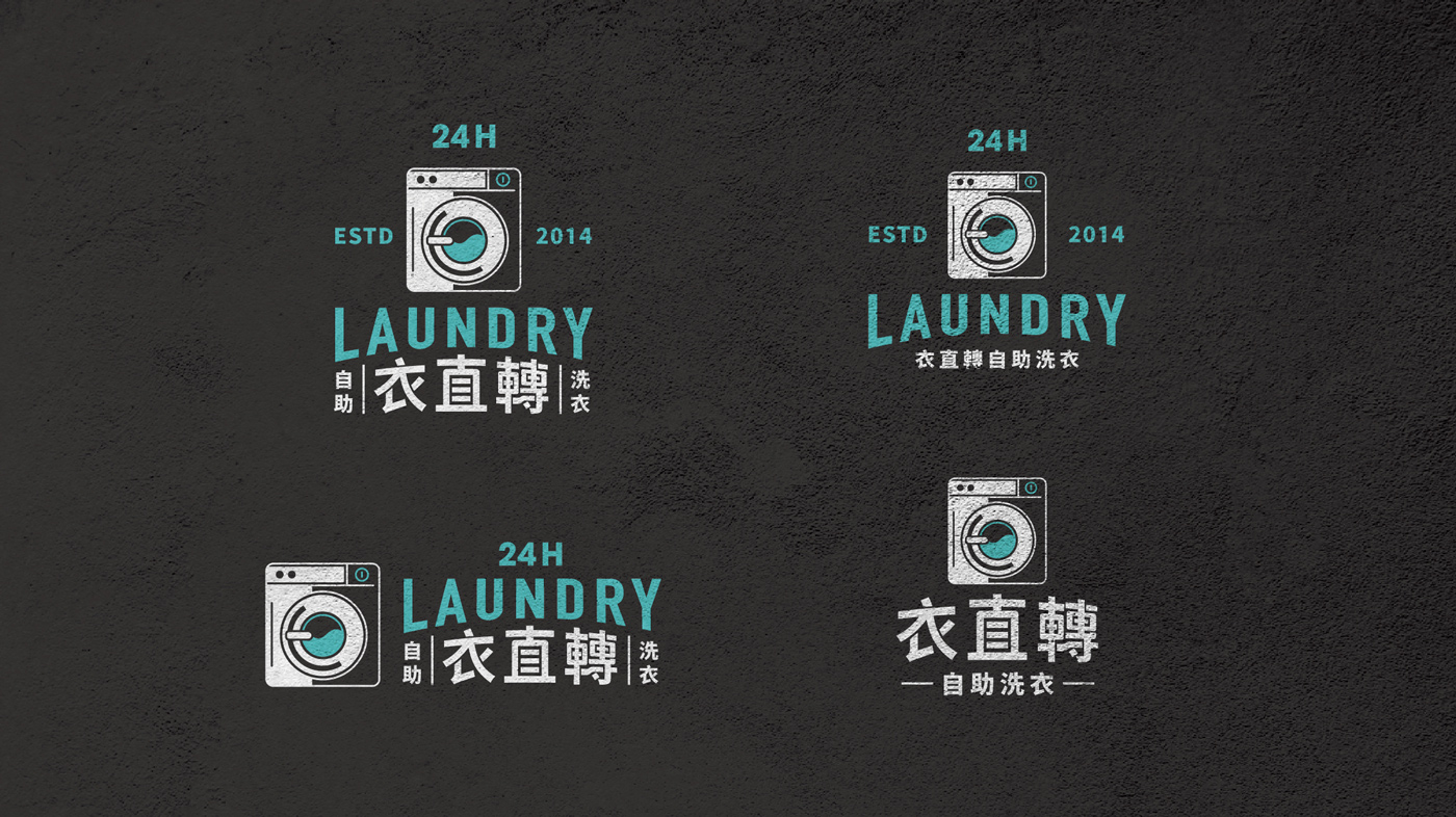
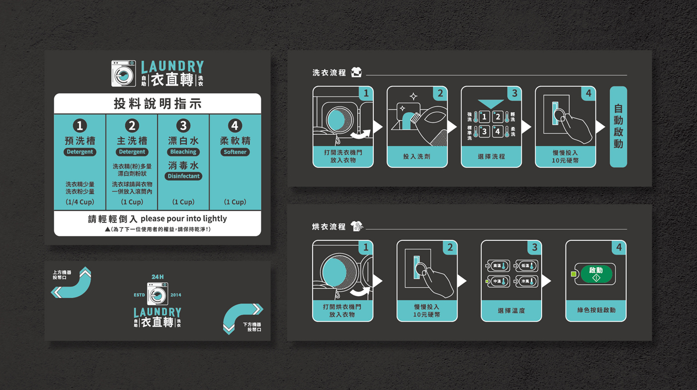
The brand design of YiZhiZhuan Self-Service Laundromat centers around a vintage American style, showcasing the professionalism and reliability of the laundromat. We selected a deep gray as the primary color to create a stable and timeless foundation, emphasizing the brand’s solidity and quality. At the same time, we introduced a teal accent color, adding a pop of vibrant energy that enhances the visual appeal and distinctiveness of the brand.
In the logo design, we combined the image of a washing machine with a modern typeface, instantly evoking the laundromat service in a way that is simple yet playful. The graphic subtly incorporates wave patterns, symbolizing cleanliness and the flow of water, conveying the idea of clothes being thoroughly refreshed. The use of teal further evokes a sense of freshness and cleanliness, providing a comforting and reassuring experience for customers.