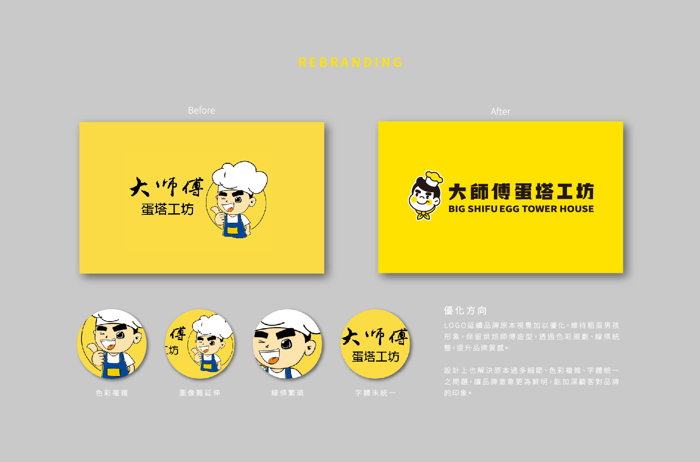
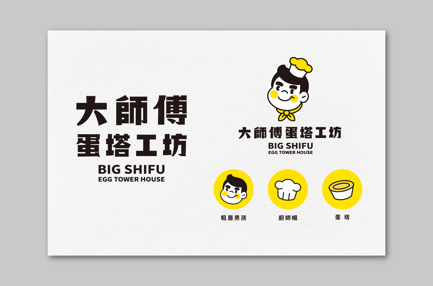
In this brand refresh project, we retained the core elements of the original visual identity, including the distinctive bold-browed boy and the iconic baker figure. Through color optimization and refined line work, we enhanced the overall brand quality, giving it a youthful and contemporary appeal.
During the redesign process, we addressed issues from the previous logo, such as overly complex colors, excessive details, and inconsistent typography. The new logo is now more streamlined and clear, ensuring high recognizability across various applications, from signage and packaging to digital platforms, thereby reinforcing customer recall.
This refresh not only improved the logo but also brought a comprehensive upgrade to the brand image, balancing familiarity with a renewed sense of vitality, and setting a strong foundation for the brand’s future growth.