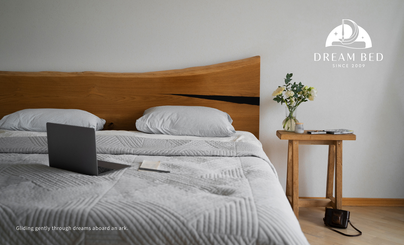
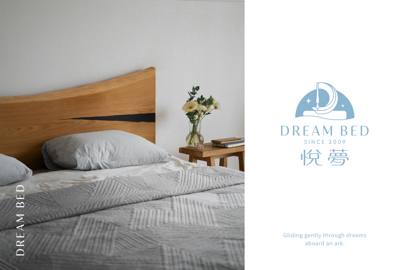
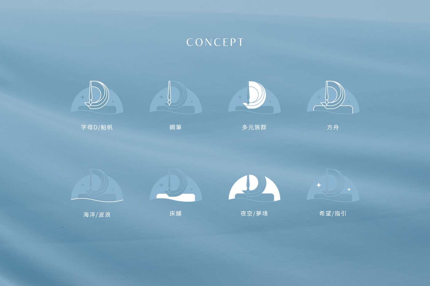
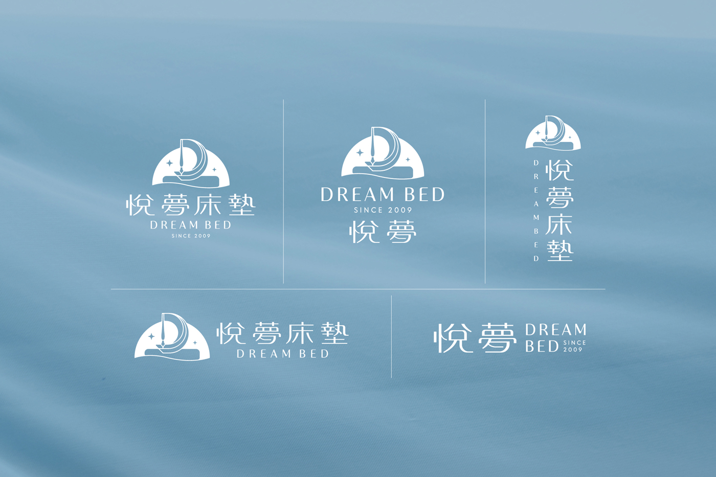
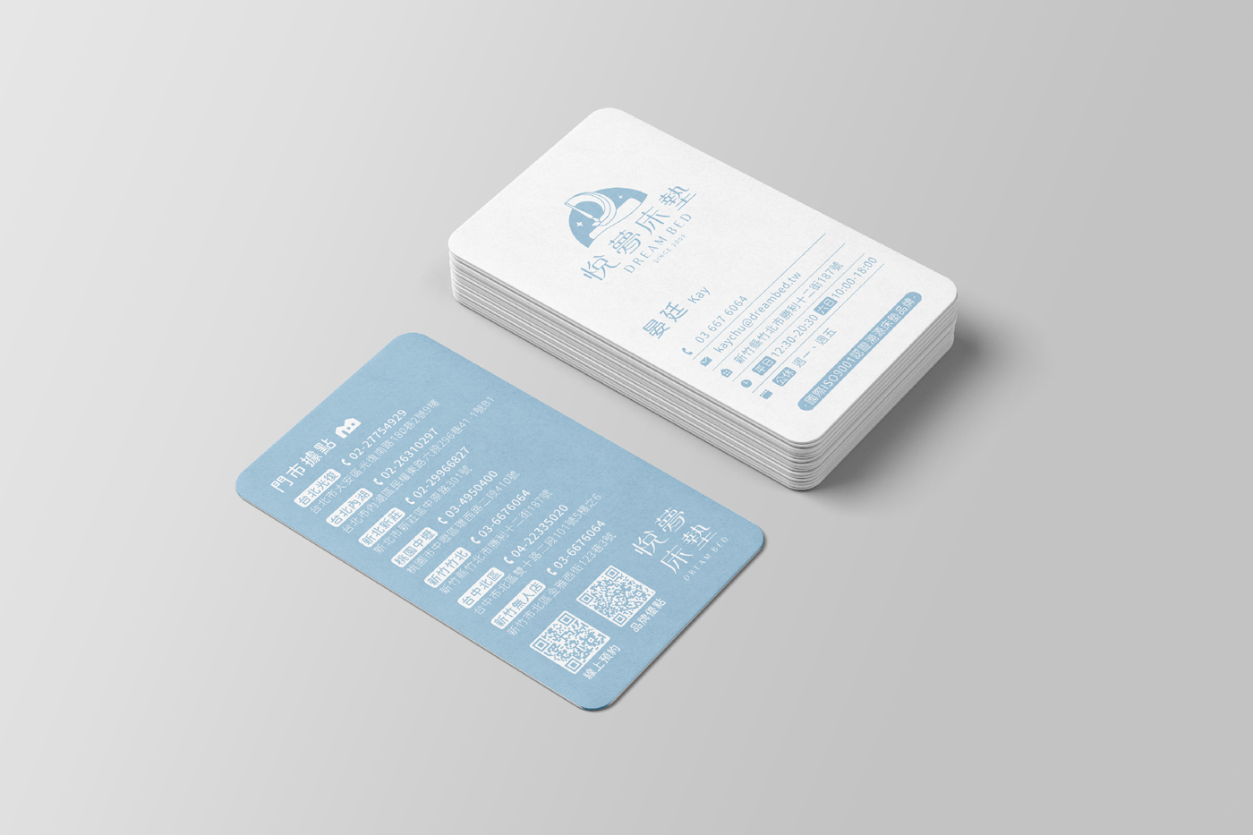
“Gliding gently through dreams aboard an ark.” The logo design is inspired by the concept of “navigating through dreams.” We envisioned the mattress as a boat, a vessel that carries you into a deep and comfortable sleep, seamlessly journeying through the realm of dreams. The design merges the shape of a sailboat, where the sail and mast are creatively formed by the letter D (the first letter of “Dream”) and a pen motif from the old logo, connecting to the mattress below. The curved lines of the waves create a warm and cozy atmosphere, symbolizing comfort. Additionally, we hope to express the brand’s philosophy through the words of “Fish Dad,” guiding the brand’s journey forward.
The choice of a boat as the central symbol was inspired by the story of “Fish Dad.” We aspire to shape the Dream Ark brand into a vessel of hope, one that supports and uplifts people. Through brand management, platform advocacy, and social assistance, we aim to provide a voice for gender diversity and marginalized communities. Our goal is to raise awareness about their struggles and challenges, offering necessary support and care, helping them navigate through the long, dark night.